A new core message aims at positioning the brand in a category of its own.
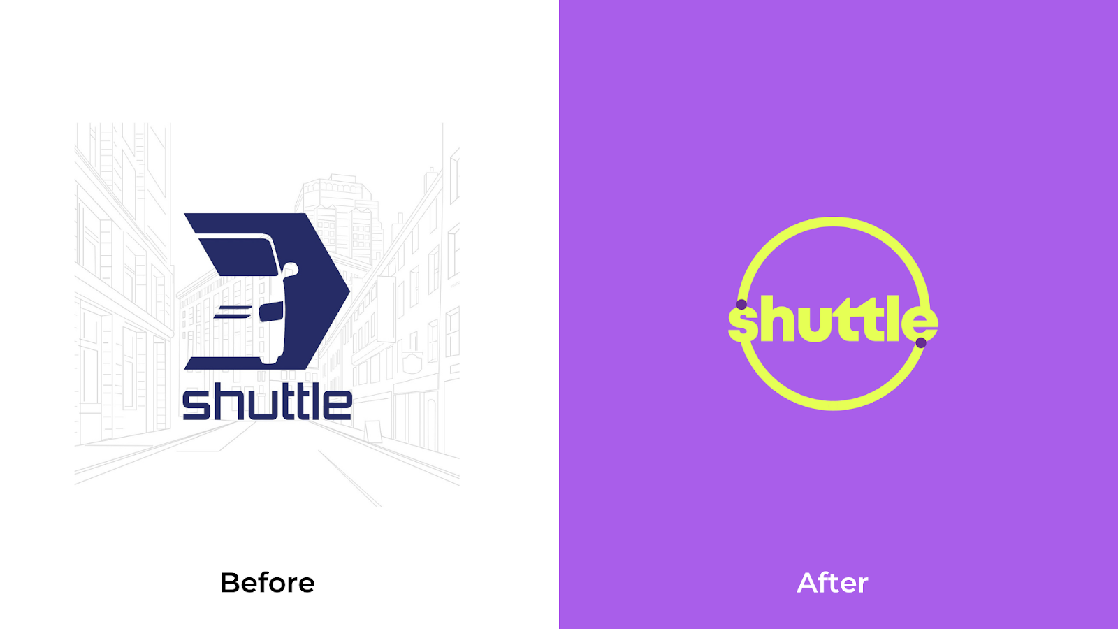
On 7th March 2022, users of the transportation app Shuttle wake up to a brand new app with an exciting new Logo and a vibrant color palette. The Rebranding comes after four years of helping customers commute from their homes to offices and universities.
Launched in 2018, the startup popularised the concept of shared travel on daily commutes. The initial offerings included pick & drop services from Home to University for female students. But, a vertical for men and office-goers were introduced soon after in 2021.
Shuttle’s remarkable growth and increase in popularity have led it to position itself as a category creator in transportation. Contrary to existing services that provide on-demand rides to any location within the confines of the city, Shuttle has gone full 180 degrees and offered rides at fixed schedules, fixed locations, and fixed fares and pooled upto 4 users per vehicle on their daily commute.
Inspired by Brand position exercises such as AVIS’ 1962 marketing campaign - “We’re No. 2, so we try harder”, Shuttle understands the importance of establishing its positioning in the market.

The American Car rental brand positioned the idea that AVIS rentals is more sincere and offers better service because they have much more to lose than their competitor (Hertz). As a result, customers always expected better service and vehicles from the company.
Similarly, Shuttle realizes the importance of establishing itself as a new category in the transportation sector. The startup relishes the idea of being a unique service provider that caters to people on their daily commutes.
Shuttle envisions a mass-transit system where customers can travel to their offices and Universities in a safe, comfortable, and reliable way while staying affordable for everyone.
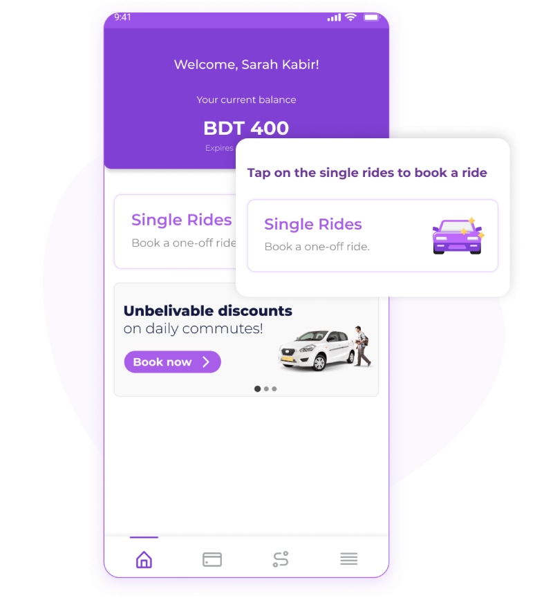
To achieve its vision, Shuttle provides rides in AC sedans and pools upto 4 riders in each vehicle. Additionally, the service offers a pre-booking system so users can rest assured that their ride to home, office, or university is guaranteed. Shuttle also realized early on the pain points of customers who disliked fluctuating prices and opted-in to a fixed pricing model where users can expect to pay the same rates across days, weeks, and even months.

The new brand identity reflects Shuttle’s vision by portraying a more vibrant and modern brand. Its energetic color palette is inspired by the bright colors that can be seen in traffic signs, cones, and vests worn by traffic operators.
This choice was made deliberately to associate the brand with commute and travel. Additionally, the new Logo is a better reflection of its services. The two dots in the logo represent the destinations people travel in their daily commute which is usually the home to office or home to university, depending on which stage of life the customer is at that moment.
Shuttle identified a gap in the market for safe and comfortable rides that is affordable for everyone. While ride-share startups offered great on-demand service and public transport provided a cheap alternative to the former, no two modes offered the best of both worlds.
Shuttle acknowledges this market gap and promises customers an affordable transport solution for their daily commutes.
The new brand identity reflects on this promise to provide a safer, more reliable commute to commuters in Dhaka City. Moving forward, the startup pledges to be synonymous with commute and offer a wide range of timing and destination options for commuters who seek a reliable, safe, and comfortable transport solution for their everyday commute.
